For the purpose of creating games, I recently played Toem. I’d like to share my thoughts on the distinct art style of Toem. Toem is created by game studio Something We Made which aims to take photographs while exploring the world.
Analysis of the creation method
Everything is black and white
The overall is black and white. Looking at other games on their website, I don’t like their color style. If Toem was like that, I wouldn’t play it.
As a travel photo game, Toem relies heavily on visual effects. The production team uses black and white color matching to avoid the problem of different audiences with different color styles, so as to absorb more aesthetic players. While I’m sure it was easy for the production team to color the map and find the color ratio they liked, there’s no denying that the black and white tones reduced the amount of work needed to control the color of the picture. No need to worry about the saturation of the color, and only need to choose between light and dark, so that the picture is clear.
Model creation
The models in the game try to show the style of splicing objects, but for the sake of workload, the models should still be built in the modeling software, rather than splicing in Unity.
The surface of the model has an obvious hand-painted style, such as irregular shaking strokes or decorative lines, simple childlike model design. Try to keep the shake of the lines when drawing the map, but completely cancel the shake of the edges of square objects and give sharp edges to blocky objects.
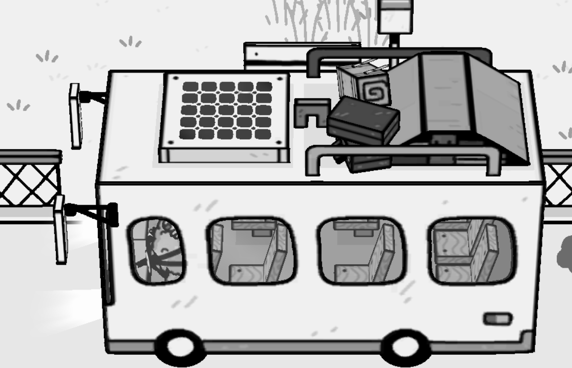
In the image below, it is more obvious that some lines were completely sharp, while others were shaken to maintain their hand-painted feel.
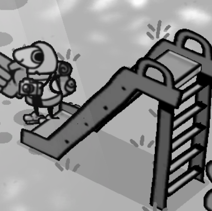
Non-model object
All non-model objects in the game have orientation recognition and orientation cameras.
transform.LookAt(targrt);
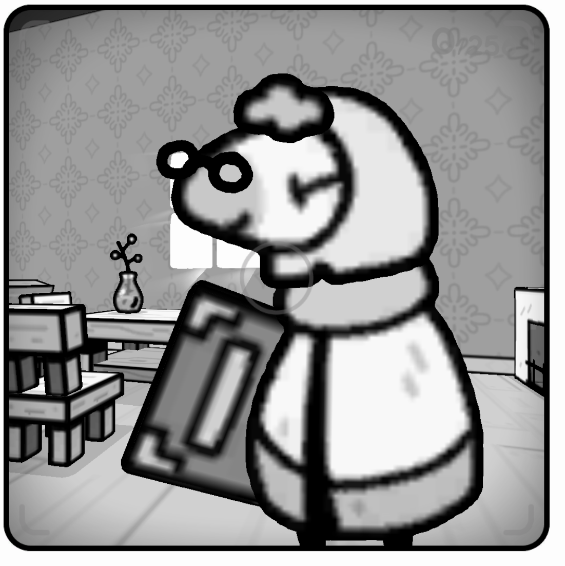
Stroke objects will be individually traced in unity using shader to make them smoother. This is even more obvious in the image below, where there is a significant distortion, but the edges remain rounded and smooth, thanks to shader stroke.
Handling of different requirements
Plant
Woody plant
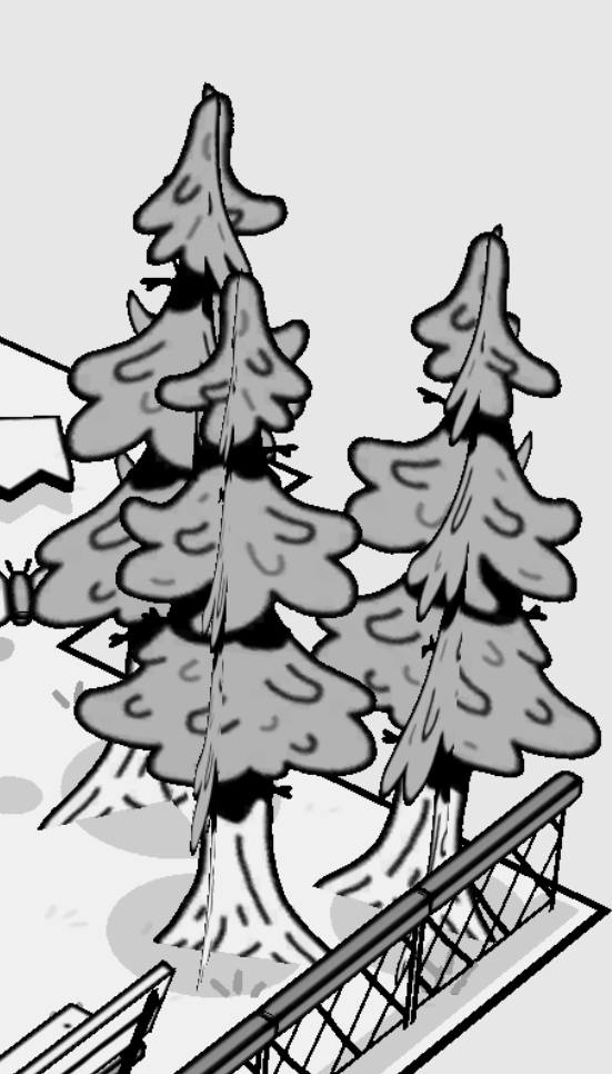
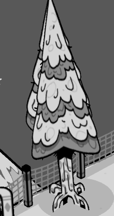
For perfectly symmetrical, tower - shaped trees, use face inserts to render. Try to avoid drawing the texture right in the center of the insert. Two colors of detail are used here to show the hierarchy of the tree.
Asymmetrical trees would be modeled, and the game would have chosen the willow tree as a prototype, summed up in a square abstraction. These trees only appear in urban scenes, and they don’t appear in separate pieces. Create variety in the tree by varying the number of blocks.
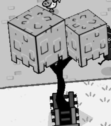
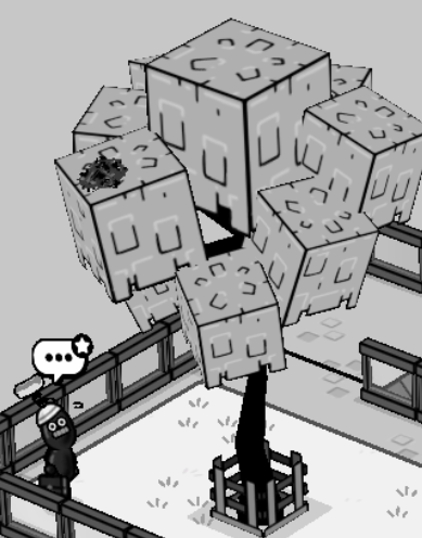
I personally like the black trunk of this tree, which is bouncing and steady.
Herb
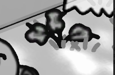
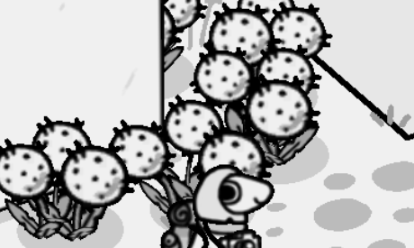
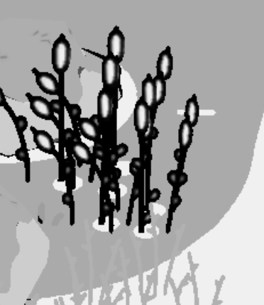
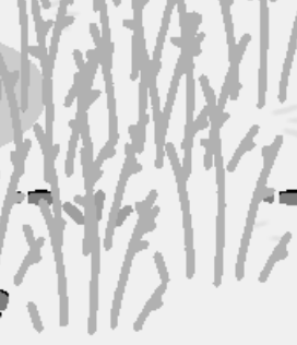
The herbs in the game are of two heights, small crops lying on the ground and plants at the same height as the characters. All herbs use pasta.
Mushroom
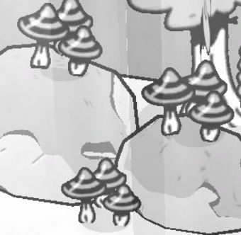
If I remember correctly, this is the only mushroom in the game. Each group of mushrooms has the same texture, so the same set of tiles is repeated.
Potted plant
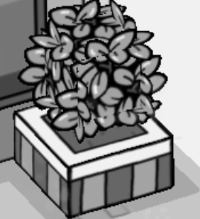
Potted solution is the lower modeling, the upper surface.
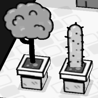
For bloated objects that can’t be cubed, the game is represented by this overflow piece, which can be seen as real if you don’t look closely, and it’s used in many places.
Ground
The richness of the ground
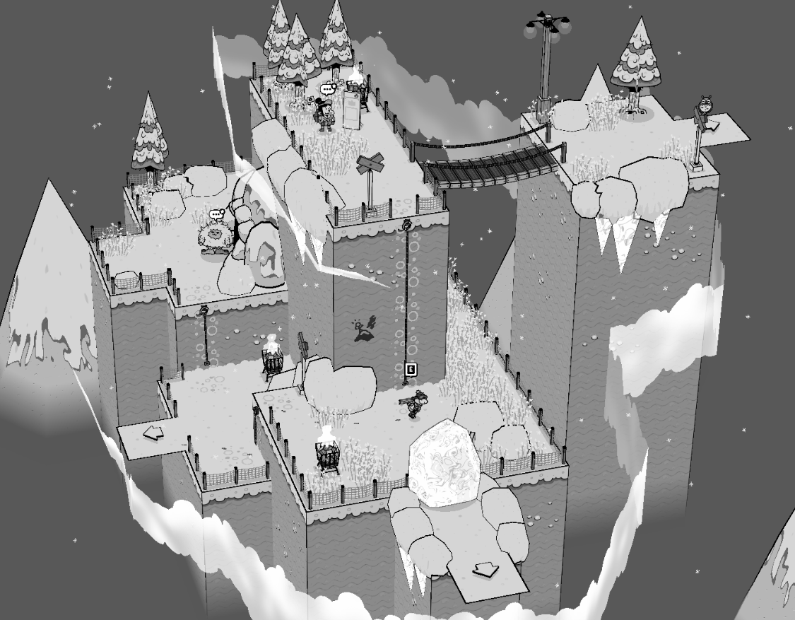
Toem is black and white, but the scenes don’t feel hollow. Here I use a forest scene as an example. In the Boy Scout scene, various plant materials are divided into three levels for placement.
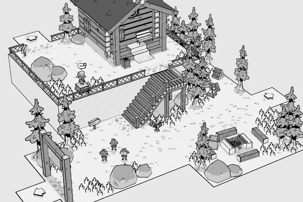
- Basic ground texture + low ground plants, grass, gravel shadow
- High ground plants, thicker grass
- Trees and rocks : Pines and rocks
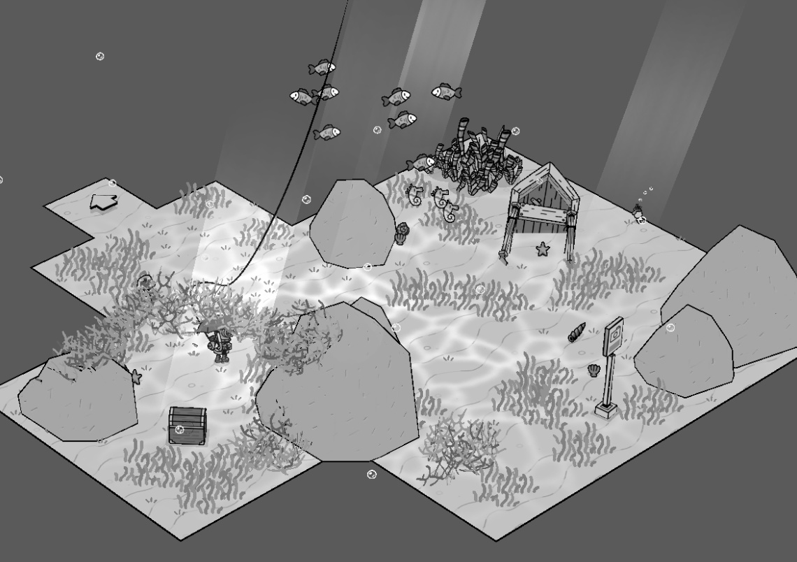
Even in other situations, the formula still holds
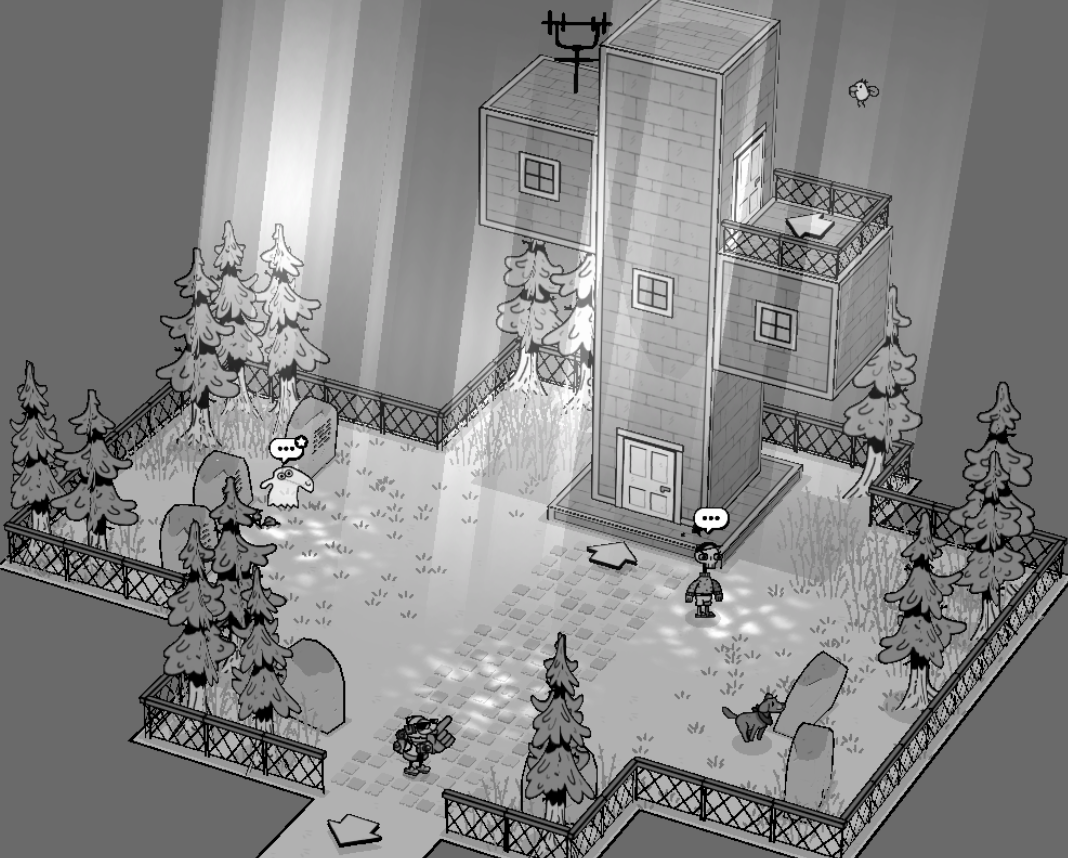
The same goes for the scene in the sea.
Texture of the ground
Toem’s floor looks simple but is filled with details.。
The Brick Floor map has two types of bricks and comes with modeling bricks, so a simple brick floor has three elements.
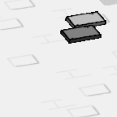
This image shows special brick sides under the lamp posts, line textures on the stairs, and bricks on the walls that are completely different from the floor.
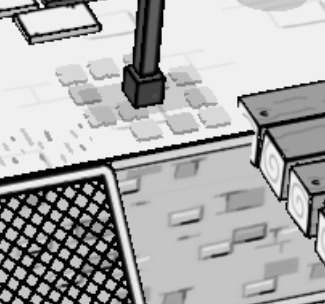
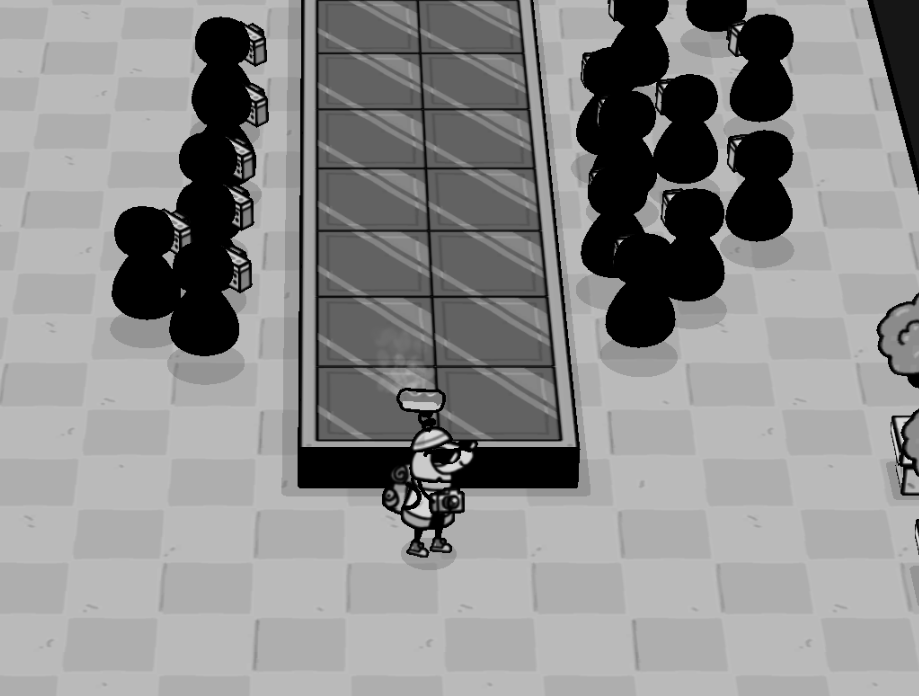
On the tile floor of the runway scene, a closer look will find that the tile edge is distributed with random black edges.
Building type
Toem’s architecture is distinguished by the best wall texture, the best corner material and the best roof design.
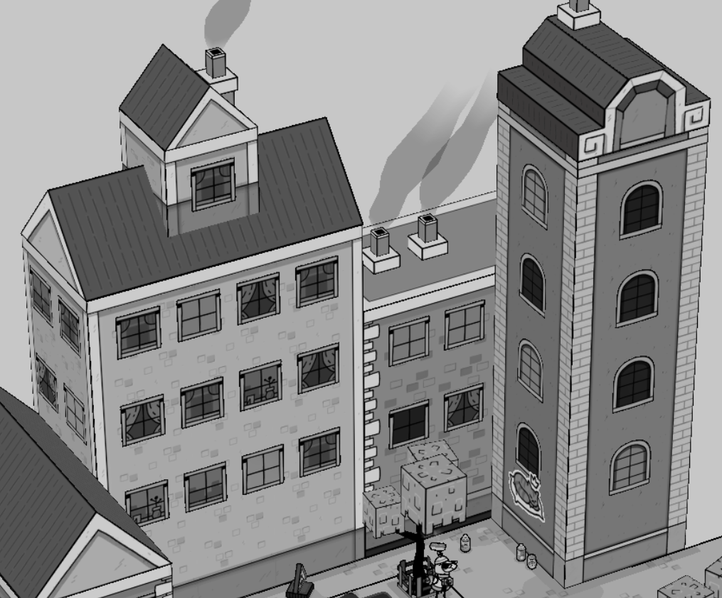
Toem made five designs for Windows to prevent a single building.
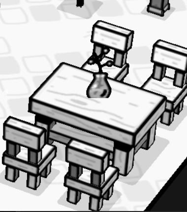
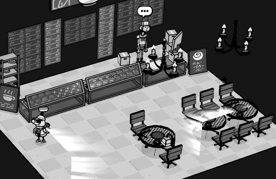
Details of the chair
Because the proportion of the characters is exaggerated, so the chair in line with the action of the characters is dwarfed.
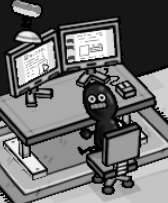
Our Creations
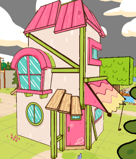
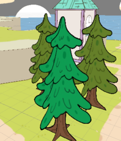
We analyzed a lot of Toem’s creation methods before production, and applied this flat style to our own creation. But because our model is not a completely cube item, the process is a little more cumbersome.
This is an experimental tree, but it won’t be used because it lacks an original design.
To create the house, a modeling software was used to extend the face and then map the face to achieve the Toem effect. It’s a lot of work, thanks to our 3D art.
